Revitalizing
the
Issues
Experience


February 2022 – June 2022
Imagine you're a company that relies heavily on open source software. While the benefits are undeniable, there are potential legal and security risks that need to be considered. That's where the FOSSA product comes in.
FOSSA is like a reliable co-pilot for your code. It scans your codebase and identifies all the open source components you're using. It keeps track of any changes you make to those components, and alerts you if there are any licensing or security issues that need to be addressed.
Yet despite the importance of this issues feature, we noticed that users were not engaging with or resolving issues inside the application. After digging into the data, our product team discovered a troubling correlation between issues engagement and customer churn, which emphasized the urgent need to improve the experience.
Process
Initial exploration
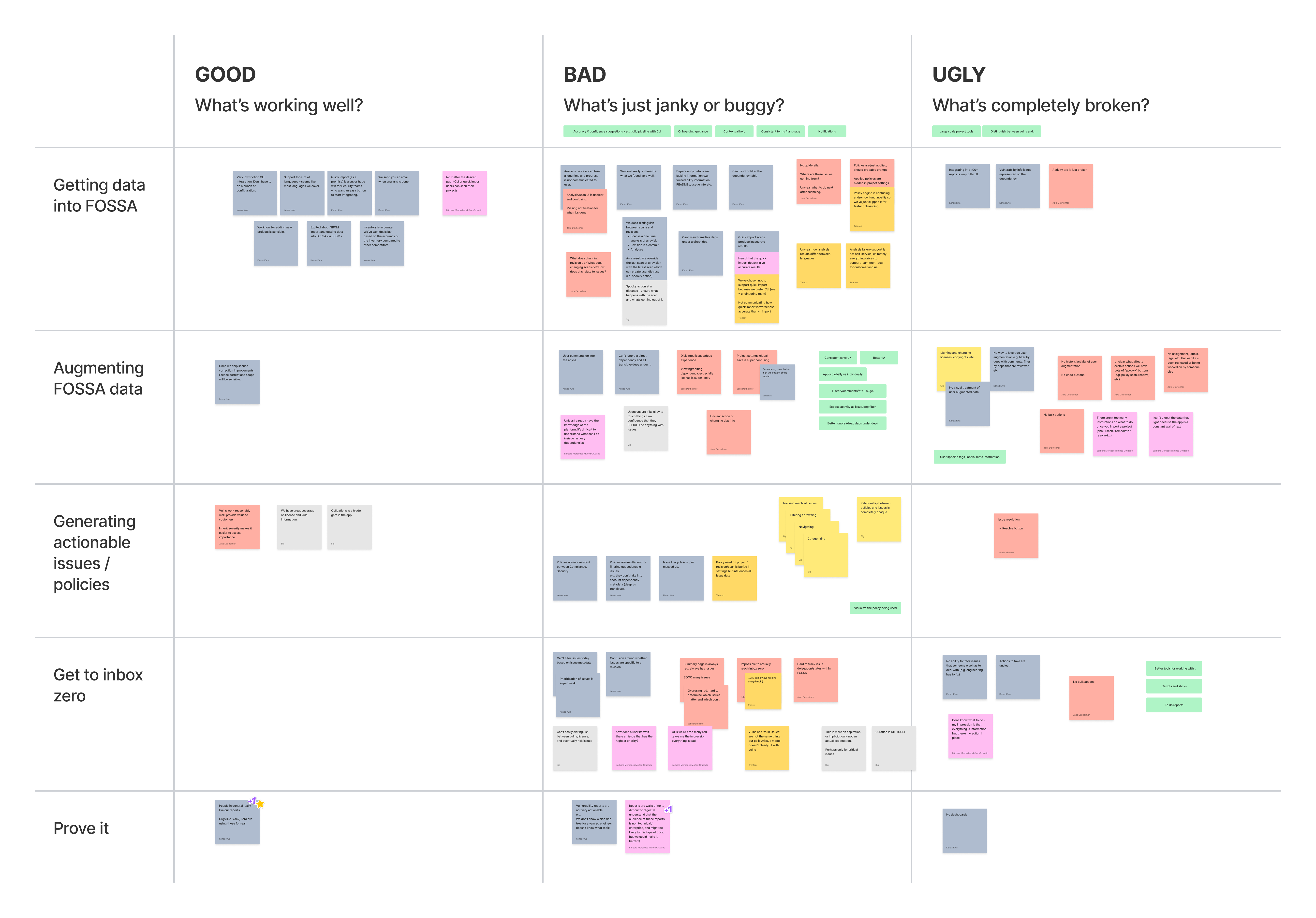
To better understand the problem, the design team interviewed customers and teammates (customer success, support, product), reviewed internal tools (Gong, Fullstory, Zendesk), and conducted a series of design exercises (see example below).

User Journey and IA mapping
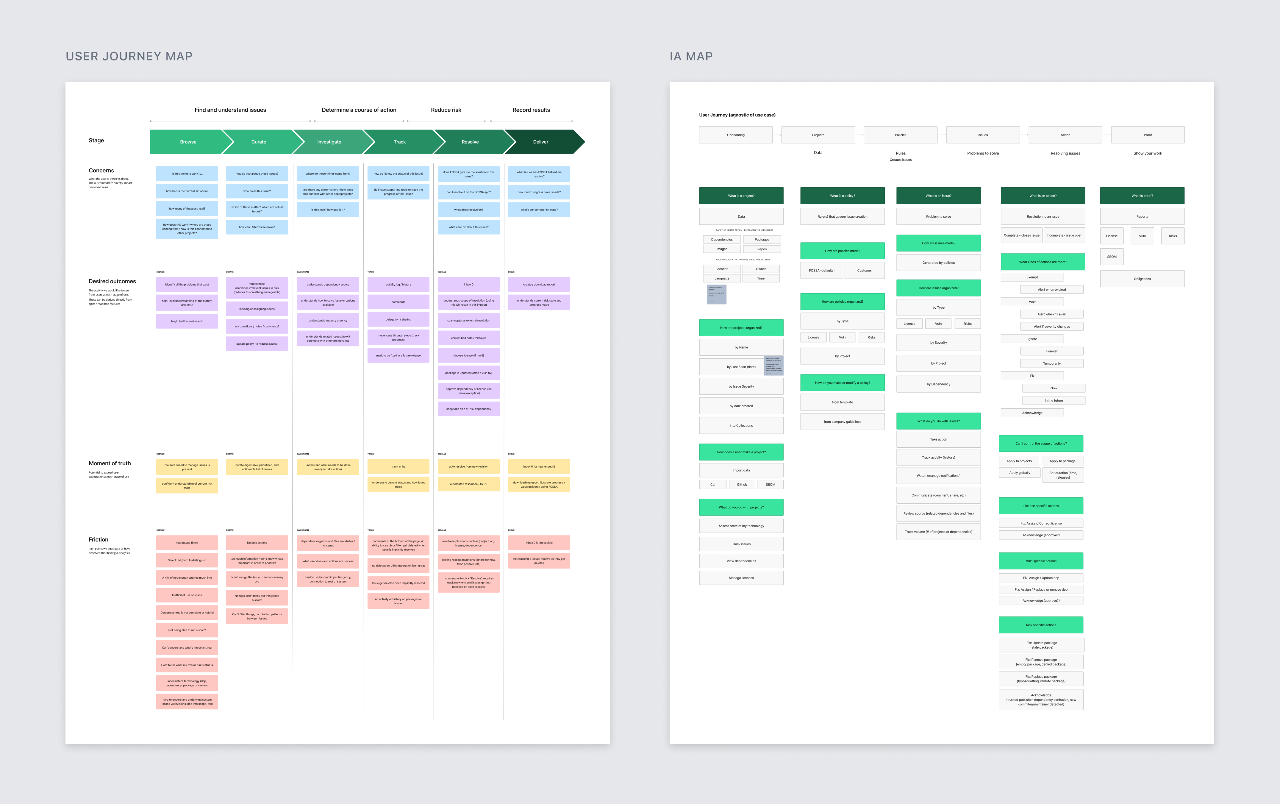
User journey and IA (information architecture) maps gave us a clearer picture of the overall workflow and helped us understand user needs and pain points at each stage of the journey.

Shape of the problem
By this point, the shape of the problem was beginning to surface and a few underlying patterns were clear:


Overwhelming volume of issues
Users struggled to manage the large volume of issues in FOSSA and lacked effective tooling to prioritize and resolve them.
- Couldn’t understand what’s important
- Inadequate filtering
- No bulk actions

Lack of clarity and guidance
Users were unsure where issues came from, how to take action on them, and the overall risk status of their codebase.
- No activity record or history
- No guide rails, actions and goals were unclear
- Hard to understand impact/connection to the rest of the system
Workflows and personas
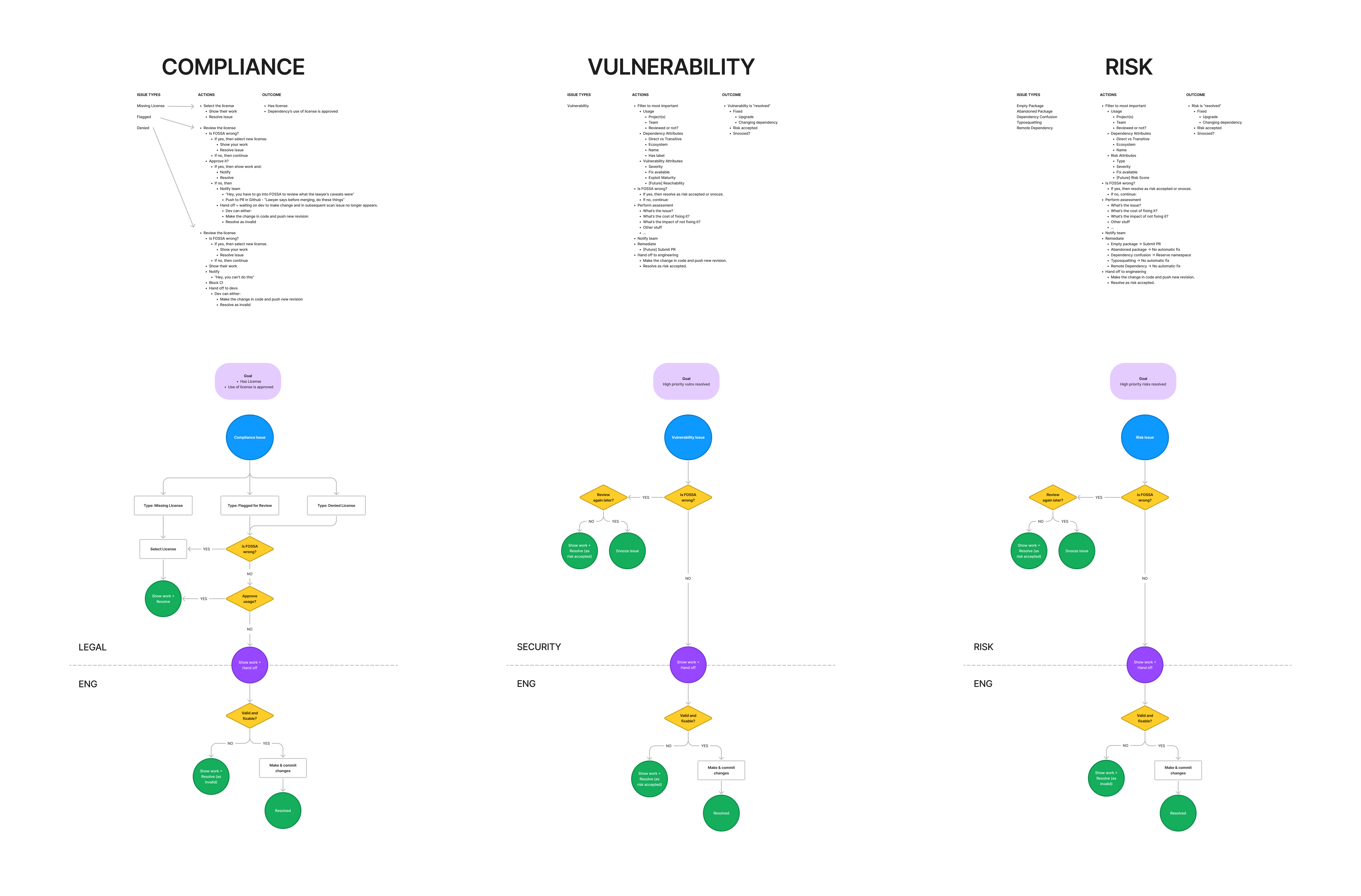
To better understand the different workflows for each issue type (license compliance, security vulnerability, and supply chain risk), we created user flow diagrams. These allowed us to zoom out and identify core patterns shared between the workflows.
We found that in all workflows the user who managed issues in FOSSA would pass the problem on to an engineer responsible for making necessary modifications to the codebase. We called these two personas the “Finder” and the “Fixer”.

Visual Exploration
Low-fidelity wireframes helped us rapidly explore ideas and obtain feedback. It quickly became clear that we needed to break the flow up into separate views: one for discovering and organizing important issues, another for diving deep into a specific issue.

Solution
Issue inbox
Easily sift through the noise to find and manage your most important issues.

Issue detail
All of the issue’s context in one place so you can quickly understand the situation. Smart suggestions help you take action with confidence.
Note: due to time constraints, this part of the experience wasn’t included in the initial release.

Documentation
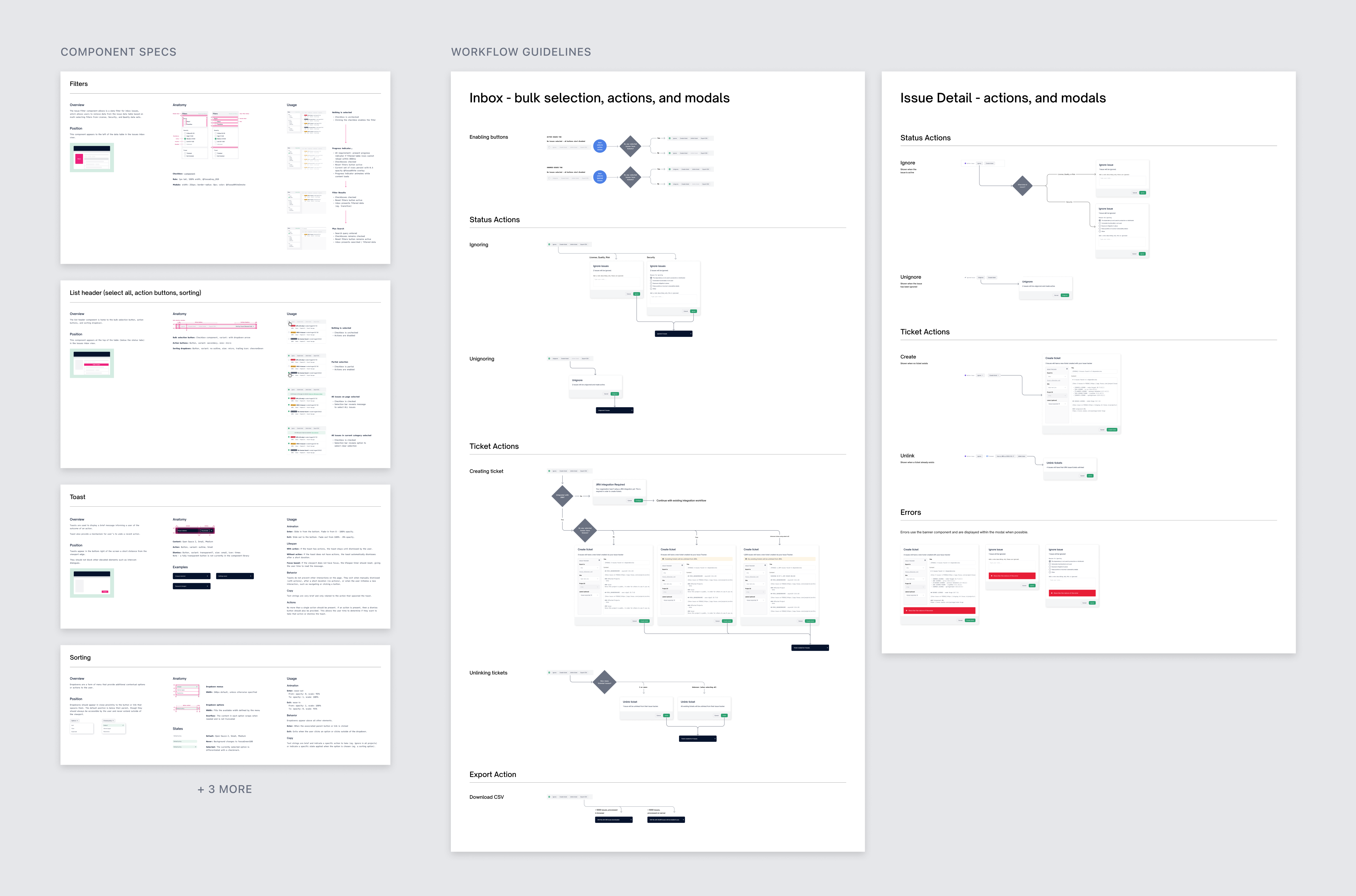
Component specifications and workflow guidelines helped us uncover edge cases and collaborate with engineering more effectively.

Closing
The new experience launched successfully: it was met with positive qualitative feedback from our users and the NPS for the experience jumped over 30 points. Engagement of our top 20 customers rose by an average of 30%.
Importantly, interviewing customers with the new issues experience led us to uncover the next set of improvements that would lead to an even better experience:
Snooze action
Issues that aren’t immediately actionable (eg. no patch available, awaiting update from dependency maintainers, etc) could be ignored until a fix is available, helping you narrow in on the issues that are actionable right now.
Saved filters
By saving frequently used filter configurations, you can quickly categorize your issues based on different priorities that matter to you (eg. high-severity, easy fix, in progress). Already successful in other parts of the application, this feature will soon be available for issues.
Issues summary
The existing issues summary could benefit from a more tailored approach that focuses on the issues you value, presents recent activity data, and uses stats/visuals to highlight trends.